Monday, 29 June 2015

Print making

Print making evaluation 

The course was pretty straight forward to begin with I knew that I had to create a final print for a client which would be the bank of China and I also had to use Asian influence is to create the print also I had to use inferences from the Bauhaus movement which I thought was a bit confusing because the styles are pretty opposite. 

A critical information in a variety of ways I will I went to the library I will research surveys and printmaking to technics I went online to be said about the house and and the prints and drawings and what the house was originally created for and then I use all these ideas and influences to help me plan and create my designs 
Wednesday, 24 June 2015

Chair evaluation

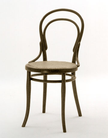
Unit 95 was a course in who I had to design and construct a chair from my own designs in order for me to have a full understanding about designing a chair I had to do my research on classic and iconic chairs produced by furniture designers going back at least 150 years so I could follow the journey of chair making especially identifying the techniques used before chairs were produced by machines and the materials that were commercially important during the 150 and why they were designed in that particular style during the course I chose to source information about the two most iconic and influential art movements  Art Deco & Nouveau that have been a foundation for exciting chair designs and even for other industries in art and design such as Poster design , Fashion and jewellery , architecture
Throughout the course I have been sourcing Information from a variety of places and I recorded them in a series of ways such as sketches, photos and drawings to show my ideas a show they have come to life so to speak although give had some difficulty sourcing my information regarding where I could get the information and how I could talk about it without it sounding or looking plagiarised.
My research based upon both the art nouveau and Art Deco movement influenced my designs heavily more so with the structure of the chair and the materials and colours used but my inspirations did not actually come from any chairs produced each of any of the movements, they came from the more of the architectural designs in France (art nouveau) which I found really interesting and exciting to look at regarding the organic and fluid shapes place together ever so nicely.
I then started to refine and review a lot of my designs that I sketched but after looking through them individually I realised that a majority of the chairs were not suitable for human use (ergonomic) because of the way I designed the chairs maybe they weren't ideally easy to sit on and keep a good posture or the material might not withstand the force placed upon it without deforming or breaking in the worst case scenario
After completing a the rough sketch of my chair I then decided to draw it in a orthographic style so I get a better visual idea on what my chair will look like from 3 viewpoint; front face, side and birds eye view all this helps me with the proportions of my chair.
My final prototype design has more of an Art Deco appearance because I chose to use a slightly transparent sheet of 3mm thick acrylic to subtitle for the polypropylene but the acrylic sheet reminds me a lot of the stained glass windows that you would commonly see in church but also there were in a lot of Art Deco designs which I found very I interesting. The overall appearance of my chair is quite futuristic but with traditional influences.  


Wednesday, 15 April 2015

Art nouveau

Victor Horta

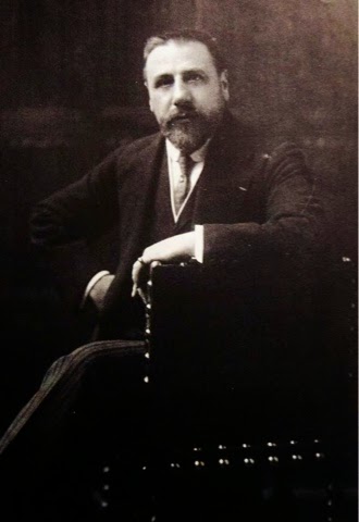
Victor was a Belgium at neither architect decorator and as I know he was born 1861 to 1947 victor was one of the leading architect and designers of the art nouveau movement his style inspired an array of modern artists who were all over Europe, Victor studied drawing, (fine art) textiles and architecture at to fine art  Academy of gent. 

 
Looking at victors work you can see a clear understanding of art nouveau, his use of line and texture is very smooth and sleek and resembles a plant in its most natural form his architecture was very inspirational to other artists because during that time and majority of pieces of furniture was very geometric and plain which gave a new lease of life for artists such as victor Horta and the art nouveau movement in the process 

Tuesday, 14 April 2015

Printing timeline


Stone Rubbing & Woodblock - 868 AD
Woodblock printing is the oldest printmaking technique, it originated in China. In woodblock the initial stages were the techniques of cutting or shaping stamps and seals. The most important precondition for the development of woodblock printmaking was the creation of paper which dates to 105 AD in China. The first early "printmaking" technique was stone rubbing. Stones, engraved with calligraphies, were closely covered with humid paper. When the paper was dry, ink was spread onto it, leaving the engraved parts white. 


Stone Rubbing  - 868 AD 


Wednesday, 8 April 2015

Unit- 95


Unit 77 evaluation

Unit 77 was in my opinion A very straightforward brief I understood what I had to do and how I had to do it I didn't experience any problems with the brief for the assignment I had a bit of concerns regarding my final painting at the end of the course plus the animation I didn't think I'll be able to get that done.
I've collected information in a variety of ways I use the library are used the Internet and I went to exhibitions such as they are white Chapel Gallery be held an exhibition called the adventures of a black squares which really helped me throughout the course covers the exhibition was based on geometric abstraction which was important in this course because I was influenced by the Bauhaus movement which which the geometric abstraction journey originated from I took down a lot of notes a lot of information into my sketchbook from my variety of sources I took them in drawings paintings bloke uploads I didn't see you like to use my blog because I wanted to work in a very traditional way where I was sort of information form of righty of places and then write it all down in my sketchbook all of my research and information about artists such as Bauhaus the arts and crafts movement Malevich Mondrian Albers Coventry and long these artists helped me to create an abstract map painting of a certain area. I chose to zoom in on a map of the area where my dad lives in Toronto is blocked and neighbourhood I wanted to zoom in on his actual block that he lives in so I took that I sourced a photo from Google Maps and I was able to zoom right into the actual

Thursday, 2 April 2015

Viewpoint Magazine

Viewpoint Presents. 

This is another magazine I created i thought it would be a good idea to focus it on a person who inspires me to be the best i could be, 
Her Poetry is simply magical, and its dark fairy tale reading her sonnets. 

so introduce you to my Viewpoint magazine: The Ashur Edition  


Still focusing on the fashion aspect I really liked how the detail on the shirt buttons and the slight look of the retro ear ring

Wednesday, 1 April 2015

Fast & Slow Shutter speed mood board

 These are images taken with a fast shutter speed setting.  
 These are images of events that have been taken with a fast shutter speed setting for example, 
 Shutter speed is the time the shutter on the camera is open for when taking a picture,  the shutter speed measurements are shown in seconds or fractions of a second: 1 s, 1/2 s, 1/4 s … 1/250 s, 1/ 500 s, etc. The faster the shutter speed, the shorter the time the image sensor is exposed to light, the slower the shutter speed, the longer the time the image sensor is exposed to light.. 

These images are taken with a slow shutter speed which caputyred the whole movemnt of the surrounds or moving object

Tuesday, 10 March 2015

Victorian fashion


During the Victorian era the Victorian women wanted to wear flattering gowns that exaggerated their figure by using corsets to clinch in the waists which makes the bust more prominent and also accentuates the lower body, then the chemise is a metal framed skirt which was 3 times the circumference of a normal gown to make the bottom area look more extravagant to show status and the more exaggerated the dress the more important you were seen by others.   

Before the time when Queen Victoria was in power men were the main focus of fashion, but with a queen in power, women surged to the forefront.  The role of the wife became to show of her husbands status and wealth to the public, with the husband himself receding into the background.
 

In the 1840's, Full skirts were supported by a vast array of petticoats.  These petticoats were made of horsehair, or stiffened with cane and padding.   

The overall look of the dresses didn't change much during that time frame.  The sleeves started to become wider in the 1850's.  The skirts expanded in size as more and more petticoats were worn.  Added flounces on the skirt would help create a wider look. 


In 1856, the cage crinoline was reinvented.  The skirts which had previously reached maximum width were free  to expand even farther.  The hoop was round in shape, somewhat bustled behind. The skirts were made of straight widths of fabric pleated into a waistband.     

In 1860, the front panel of the skirt is very slilghtly gored. Very quickly, the side panels of the skirt become gored also. Skirts will get narrower at the top every season, and the panels ever more gored. 

By 1863, the hoops took on an eliptical shape, with the back fuller that the front. The skirts are often gored in the front and sides, the back are still straight breads of fabric.   During the Civil War, hardships caused a decline in the amount of fabrics and trimmings used in the dresses.  The excessive flounces became fewer and finally disappeared. 

1867 saw a reduction in skirt size all together due to the weight of the chemise effecting the female figure especially regarding the waist and hip area. 


Jamie Reid

Jamie Reid is a British artist who designed artwork for the Sex Pistols album, Never Mind the Bollocks 


In 1947 anarchy and influential British artist Jamie Reid was born in London, England. Raised in a politically active family, Reid went to  Croydon College in London 

Reid left Croydon in 1970 Already a committed anarchist, Reid connected himself with the Situationists, a group based in France that advocated for a strain of libertarian Marxism. 


 In 1978 was the end of the British punk scene however Reid continued to work as an artist, infusing his work with his political leanings. He's worked with a lot of artists to protest nuclear weapons, racism and a fairer criminal justice system. 

This is my favourite piece of work by Jamie Reid his God save the queen poster really stood out to me among all the rest especially as he pushed the boundaries of art with the controversial interpretations from the general public regarding covering the queens eyes and mouth which in some option could  symbolise the end of the Queen like how you see in a lot of scary movies with a image of a person with their eyes scratched out which I actually like the whole rough cuts out creates texture and surface within the image all the ransom note style typography is really interesting